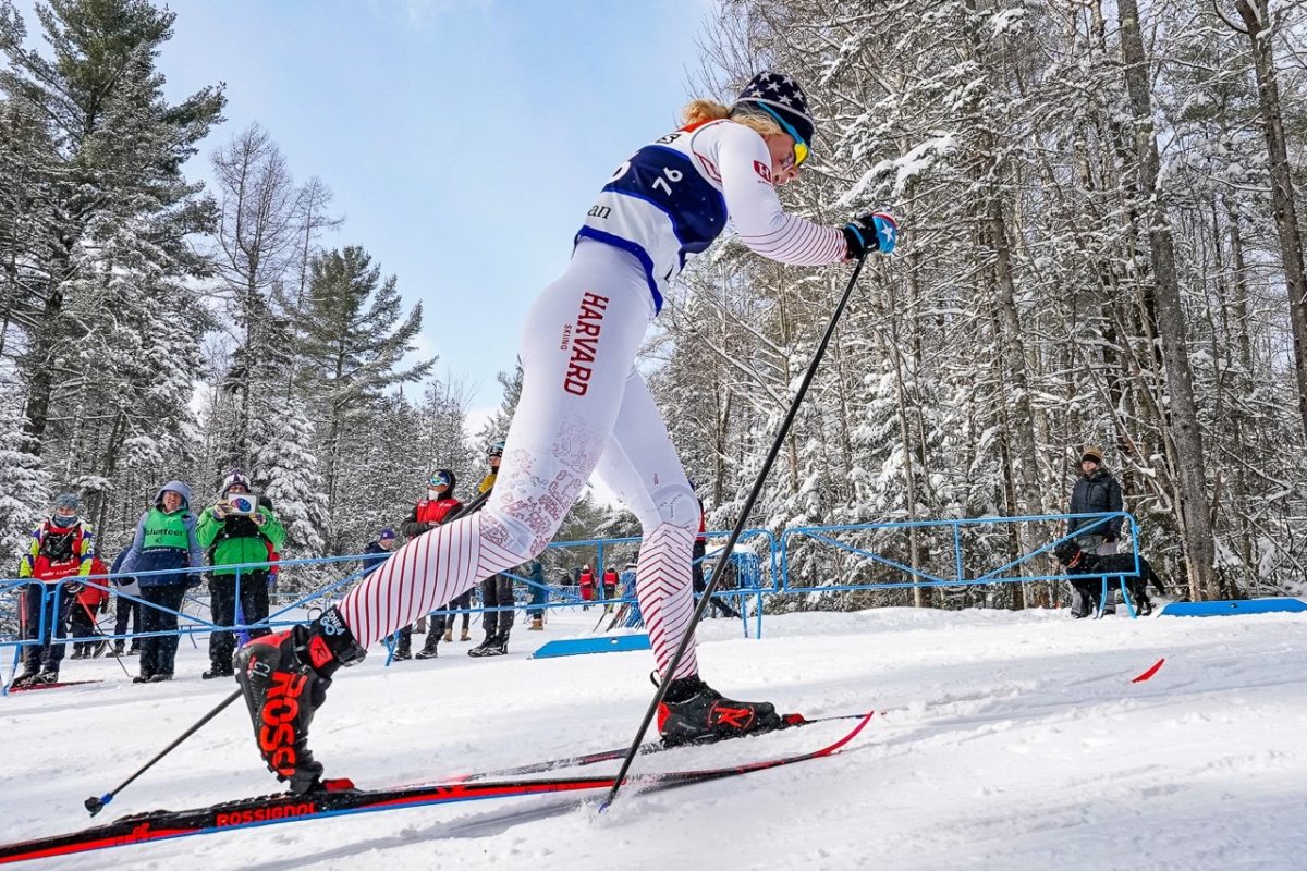
FasterSkier previously surveyed the national-team uniforms from last year’s World Cup fashion season, starting with more traditional nordic powers (Norway, Russia, et al.) but also taking a look at some more outré ski countries (Brazil, Nigeria, Thailand). We didn’t run a comparable article at the start of this season, as there was relatively little change in most nations’ World Cup kit from last year to this year.
But when the Olympics arrive, however, all bets are off. Sponsor logos are out. Direct evocation of a nation’s flag is typically in. Unless you’re Norway, or Russia, albeit for different reasons.
There are lots of countries that sent cross-country skiers to this year’s Winter Olympic Games (54, in fact). Compiling photos of all of them would make for a very long article. Instead, this article surveys those countries that entered a team in the men’s 4 x 10-kilometer relay, using relay participation as a general proxy for international competitiveness. A follow-up article will focus on the women and on some less traditional nordic nations, by means of surveying finishers from the bottom half of the women’s skate sprint results sheet.
This article undertakes to rank the men’s relay race suits in, roughly, descending order of vexillological evocativeness, that is, how much does each race suit look like that country’s flag. This is a necessarily subjective inquiry; your own rundown may differ. No offense is intended toward countries in the bottom half of this list: A lower ranking does not mean that a suit is “bad,” just that it is less readily flag-like.
Note well, a handful of photos in this article come from races earlier in the Games, not from Sunday’s relay; it appears that there were no relay photos for these nations in the typically comprehensive NordicFocus library. Relatedly, all shots in this article are copyright NordicFocus, which has been doing an amazing job throughout the Olympics.
Finland
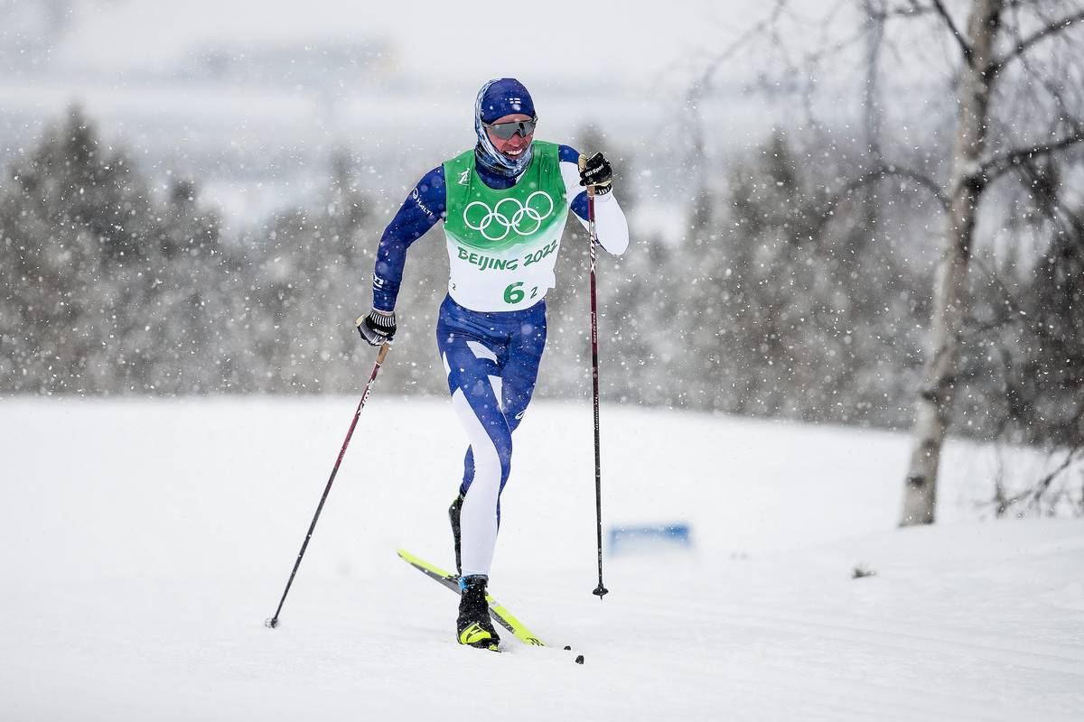
The Finnish flag looks like this: 🇫🇮. Iivo Niskanen’s suit looks effectively the same. If one were, hypothetically, a Finnish athlete putting down an all-time relay performance to drag one’s team back up toward the front of a splintered men’s 4 x 10 k relay, there would be little doubt what nation you represented while you did so. This suit has the two colors of the Finnish flag, the dominant design element of the Nordic cross, and little more. It sure looks like the flag of Finland.
United States of America
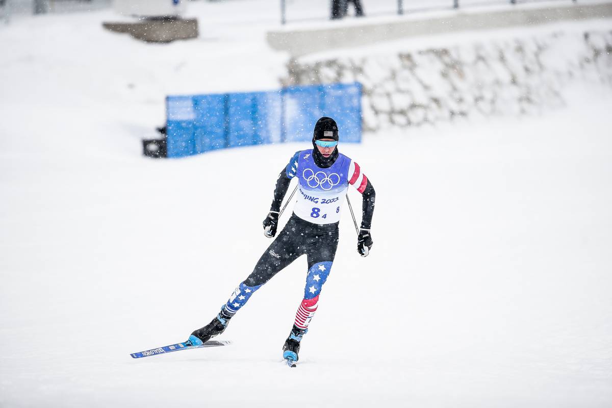
The American flag, you are likely aware, looks like this: 🇺🇸. There are two main elements in the American flag, the stars and the stripes; both are represented here. (Added points for the relay socks, an after-market add-on that further emphasize the “stripes” aspect.) America should arguably be ranked below Sweden, for the dominant use of a color, black, not present in the nation’s flag, but has been slotted in here in second because the stars and stripes for America seem more flag-like than the evocation of a Nordic cross does for Sweden. You can find much more about historical American uniforms, both Olympics and World Cup styles, here.
Sweden

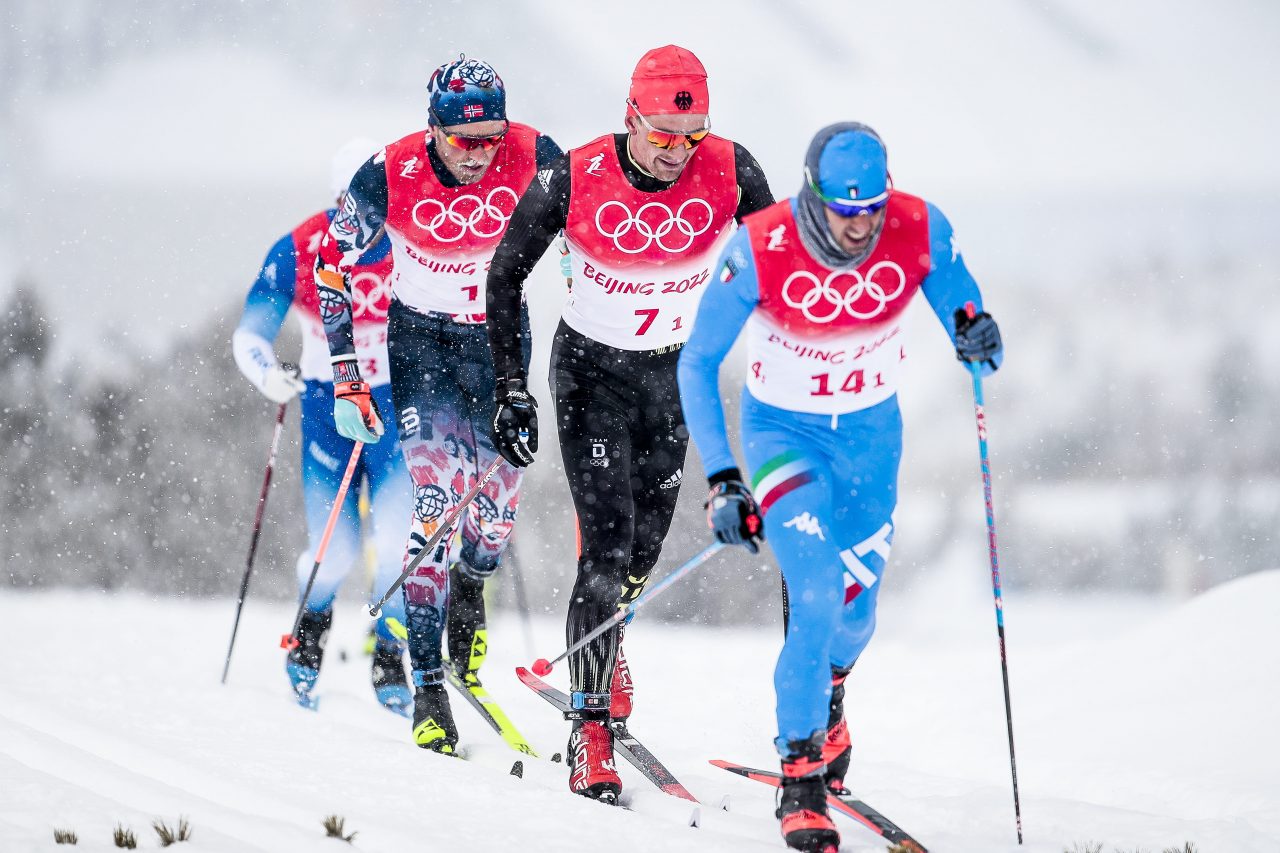
The Swedish flag looks like this: 🇸🇪. This uniform does not really depict the Nordic cross per se, but the consistent use of yellow and blue, augmented by only the neutral white, means that the overall evocation of a flag is quite strong.
Czech Republic
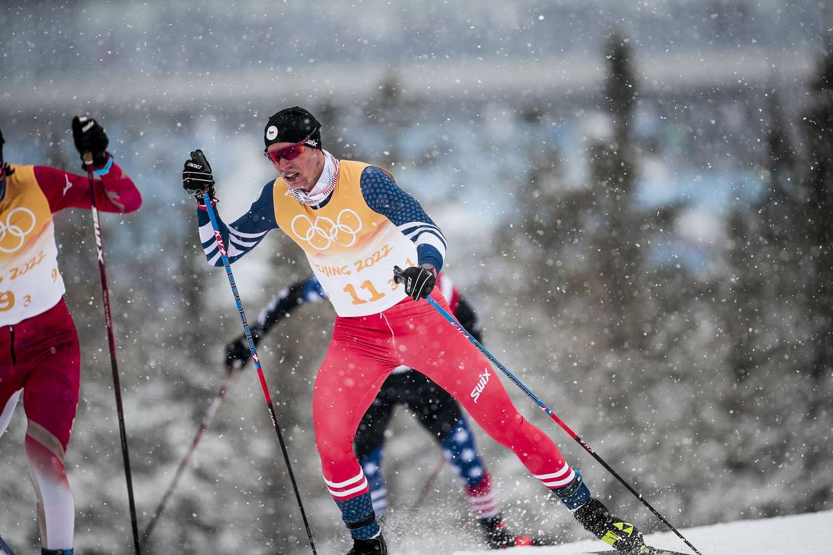
The flag of the Czech Republic looks like this: 🇨🇿. This suit does not precisely portray the flag outline, but otherwise ranks high for featuring only the three colors from the flag, and nothing else. Could conceivably be pressed into service as a U.S.A. alternate suit, or maybe the current American biathlon suit.
Estonia

The flag of Estonia looks like this: 🇪🇪. Much as with the Czech flag, Kilp’s ensemble does well by using only the relevant three colors from the national flag. The overall effect is aided by the coincidental use of blue and white in this race bib from the skate sprint, which differs from those used for three legs of the four-leg relay.
Switzerland

The flag of Switzerland looks like this: 🇨🇭. This suit does well in that it uses only the relevant two colors. It does less well in that the instantly recognizable visual element of the flag, the Swiss cross, is not present here. (In Switzerland’s defense, it has the rare square national flag, so translating this to race-suit format may be difficult.) Also, the red–white ombre through the legs is trippy; cf. France, infra, which does much the same with blue and white.
Italy
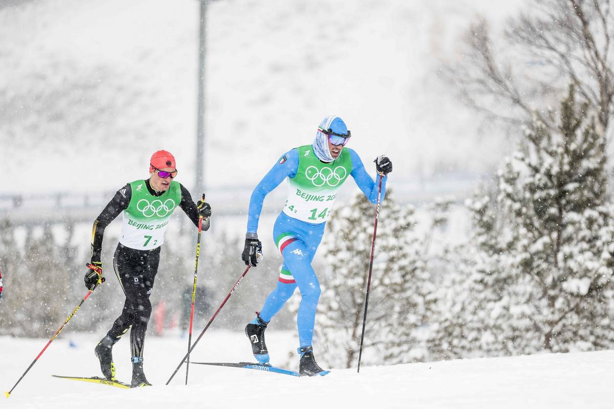
The flag of Italy looks like this: 🇮🇹. The dominant hue in this uniform, blue, evokes “the traditional paint of the royal House of Savoy, which reigned over the Kingdom of Italy from 1860 to 1946,” per Wikipedia, and is characteristic of Italy’s international sports teams, such as the national football team known as gli Azzurri. The tricolor bands on both upper legs, mirrored on the right shoulder, do a surprisingly successful job of typing this uniform as Italian against this blue background.
Japan

The flag of Japan looks like this: 🇯🇵. This uniform falls into roughly the same category as Switzerland’s: instantly recognizable design element (the flag is “more commonly known in Japan as the Hinomaru (日の丸, ‘circle of the sun,'” per Wikipedia) that is not really present in the suit. Ranked below Switzerland due to the use of additional colors beyond just red and white; there is a sense of gold accents along the lower left leg, which works well aesthetically but falls outside of the flag palette.
People’s Republic of China

The flag of China looks like this: 🇨🇳. This uniform is ranked relatively low, when it comes to evoking a country’s flag, because the distinctive five stars (“the five stars and their relationships to each other represent the unity of the Chinese people under the leadership of the Chinese Communist Party,” Wikipedia advises) do not seem to be present. Zooming in on the hi-res version of this image suggests that the detailing on the torso and lower legs is variegated and visually compelling, but also does not look like stars. It is a fine suit, but ranks low on the specific axis of flag–suit evocation.
Canada
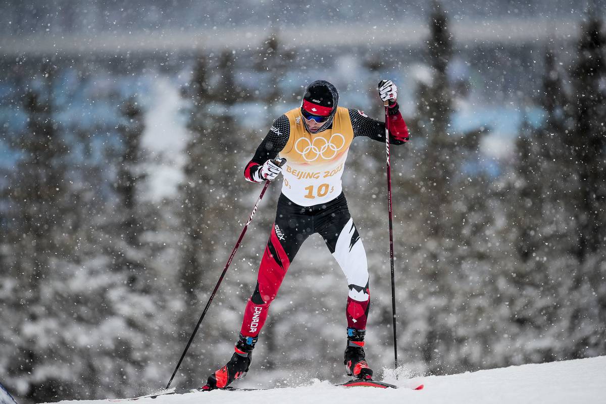
The flag of Canada looks like this: 🇨🇦. It is universally known as the Maple Leaf (note Léveillé’s headband, for example, or the Canadian World Cup suit that literally features flannel-patterned maple leaves on the lower legs). This suit is ranked low here because the presence of a maple leaf is subtle at best, and for the dominating use of black, a non–flag color, through the torso.
France
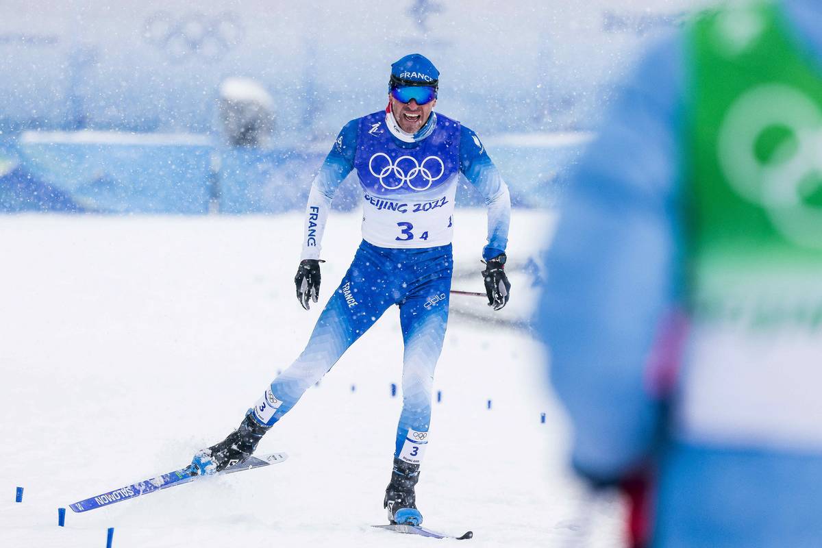
The flag of France looks like this: 🇫🇷. It is also known as the Tricolore, or, well, “three colors.” The suit is ranked low, in this compilation, because only two of the three colors are present here. That said, the coordination with the blue and white Salomon skis and boots is sublime, though the suit overall looks suspiciously like it came from the same template as Switzerland’s, q.v., supra.
Germany
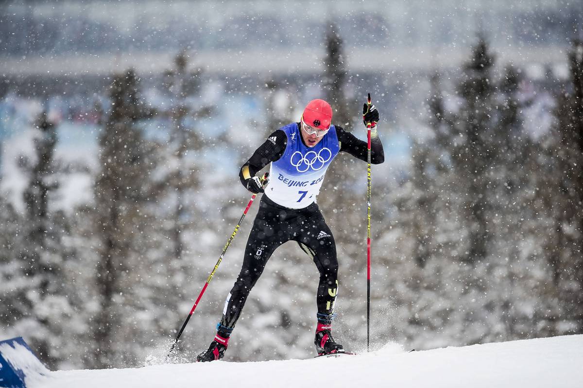
The flag of Germany looks like this: 🇩🇪. Much like France, the German flag has three colors, in this case the national colors of black, red, and gold. The suit is scored low in this compilation because of the extent to which the first of these colors overpowers the other two (indeed, it is not clear that red is apparent anywhere within the suit itself, as opposed to on the hat). It is a stark and imposing suit, it just does not look very much like the Flagge Deutschlands.
Slovenia

The flag of Slovenia looks like this: 🇸🇮. This suit is imho amazing, and I frankly love it, but I had to rank it this low because it does not exactly evoke a red, white, and blue flag. (For purposes of comparison, here is last season’s Slovenian World Cup suit, which is notably more flag-like.) If you are from Slovenia and can explain to me why these colors and this design showed up in this year’s Olympic suit, please let me know: gavin (at) fasterskier.com. I am not making fun; I am just sincerely curious. Also, I honestly love this suit, even if at first glance I thought it was the suit of Ukraine or Australia.
Norway

This is… certainly a look. This suit puts the “illogical” in “vexillological.” This is the flag of Norway: 🇳🇴. This suit is notably memorable, and has occasioned strong reactions throughout the Olympics. It does not, however, whatever else you may say about it, look particularly much like the Norwegian flag.
Russian Olympic Committee

The Russian flag looks like this: 🇷🇺. Russia is not officially competing in these Games, just athletes representing the “Russian Olympic Committee.” It’s complicated. One result of these complications is that “Russian” athletes are racing in a suit that does not really resemble the flag of Russia. Again, it is a fine suit, just not particularly Russian flag–like.
Gavin Kentch
Gavin Kentch wrote for FasterSkier from 2016–2022. He has a cat named Marit.

